Below are some examples of the kinds of questions we are exploring about visual perception and adaptation.
For a full list of our studies see our
Stare at the center of the 4 colored squares for several seconds and then look at the center of the white squares
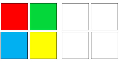
The color afterimages you see result because each part of your eye adapts to the average color it is exposed to.
If your perception can change so dramatically in a matter of moments, how is it affected by the visual world you are currently surrounded by? What properties of that world do you adapt to? And what are the consequences of that adaptation for how you see and what you see?
These are the questions we are addressing by studying the visual characteristics of the world and the states of adaptation they hold us in.
Would you see color differently if you lived in a forest or desert? Do our own color percepts cycle with the seasons?
We have studied these questions by measuring the color statistics of outdoor scenes and by using psychophysics and modeling to probe how the visual system adapts, and what this adaptation reveals about the neural encoding of color.
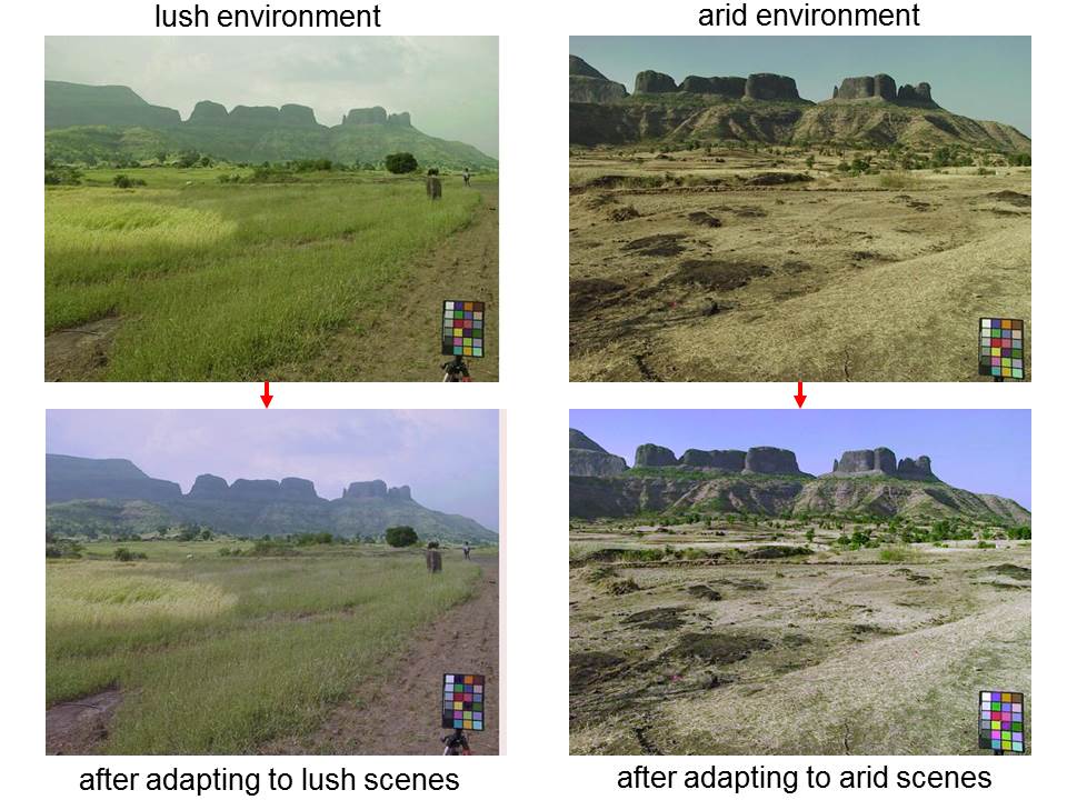
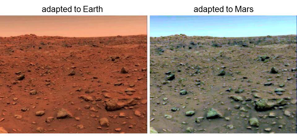
We also use models to simulate very longterm and theoretically optimal states of adaptation, in order to assess the function and consequences of adaptation. For example, the images below simulate how Mars might appear to someone living there.
Our work shows that features of the world become more salient once we are adapted to our current visual environment.
We use similar models to predict the consequences of sensitivity variations in observers. For example, as we age our lens yellows, but adaptation acts to filter this sensitivity bias from our color percepts. This is consistent with findings that older and younger observers, or color percepts between the fovea and periphery, are much more similar than the differences in spectral sensivity predict.
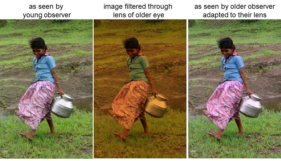
We compare these predictions with actual measurements of color vision in the lab and in the field.
Our studies suggest that the extent to which we see similarly or differently depends importantly
on the extent to which we are adapted to the same or different environments.
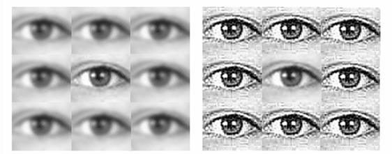
Adaptation adjusts to many different properties of the stimulus, and to many properties of the observer. One important way that people vary is in the blur produced by their eyes' optics. We study how the visual system adjusts to this blur, and the extent to which we can adjust to the patterns of blur specific to our own eyes.
Notice that the center eye on the right appears blurrier than the center eye on the left even though both are physically focused.
The blur is induced by the sharper eyes in the surround. This blur contrast is a spatial analog of the blur adjustments that also occur over time through adaptation.
Adaptation adjusts not only to low-level features of the image, but also to high-level or abstract characteristics of our world.
We have studied how the appearance of someone's face is biased by the faces you have seen previously.
For example, after adapting to a distorted face, a normal face appears distorted in the opposite direction.
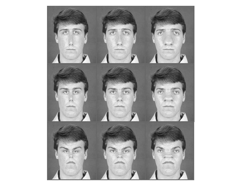
Work in our lab and many others shows that adaptation is important in calibrating most of the characteristics we notice about the face, from identity to expression. We are using these adaptation effects to understand the visual codes for representing faces.
How are our perceptions affected by adaptation to the artificial and specialized visual worlds that we increasingly live in? We are studying this question by examining how radiologists are adapted to the images they are inspecting, or how our color perception will adapt to artificial lighting.
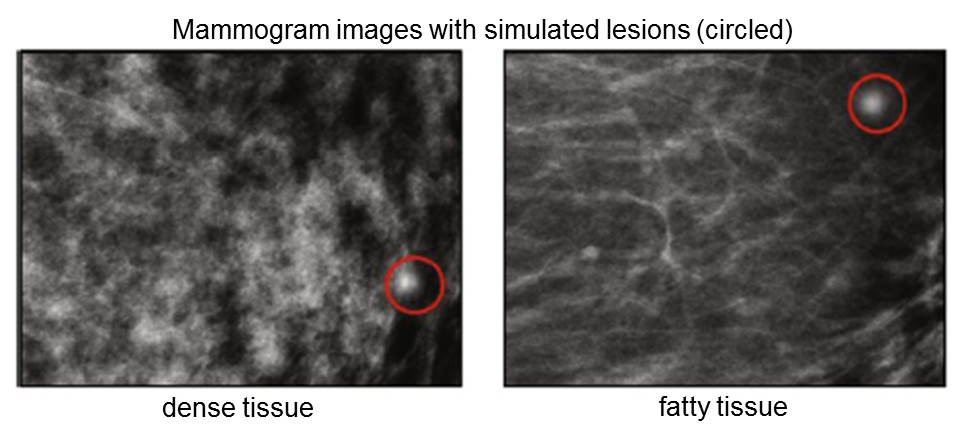
Our work shows that observers rapidly adapt to the properties of medical images, and that this adaptation may help them detect abnormal features (e.g. simulated lesions) more quickly.
Beyond adaptation there are many sources of individual differences that affect how we see. We are exploring these to examine basic mechanisms of visual coding and how it varies across observers.
Dramatic differences in color perception were recently highlighted by the #thedress. We showed that the ambiguity in the image is due to the blue shades in the image. When these shades were inverted to the equivalent yellows, there was almost complete agreement in how the dress colors were labeled.

This site was created with the Nicepage